

How to Create Content for Outdoor Digital Displays
Be sure to check out our other posts in this series: When to Update & Schedule Your Outdoor Digital Sign Content and What Colors Should You Use in Your Digital Signage Content?
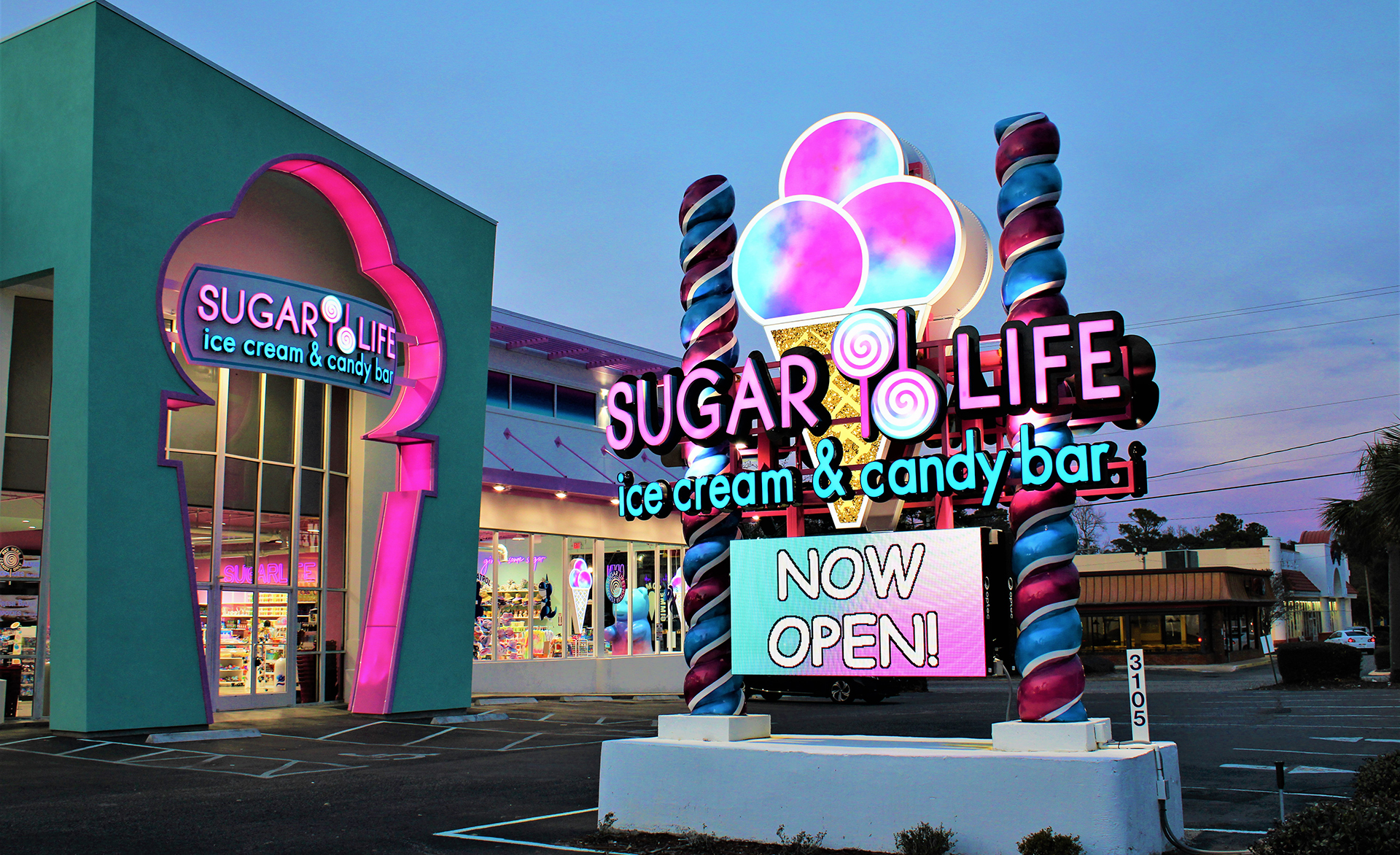
Some of the many benefits of outdoor digital displays include the ability to display several messages in a series of rotations as well as the ability to change out that messaging in seconds. Digital outdoor advertising also has a higher recall than radio, magazine, and newspaper advertisements.
But how can you design great content for digital signage?
What are the goals of digital signage content?
Let’s start with the goals you may have for your digital signage content:
- Increase brand awareness and entice consumers to purchase your goods or services.
- Attract the attention of your audience by displaying content that’s clear, concise, and memorable.
- Create an emotional connection with potential customers and build your brand recognition.
- Inform your audience of timely updates, products, or services.
When designing digital sign content, ask yourself: What are you trying to convey to your audience? Make sure that each piece of content matches at least one of the above goals.
What are the do’s and don’ts of creating digital signage content?
When it comes to outdoor digital displays, your viewers are usually seeing the sign while moving and from further away (read more about viewing distance here). As a result, the message most be clear, concise, and easy to understand.
- DON’T include too much text on your display. Unlike a print advertisement, digital messages don’t have to convey everything in a single advertisement.
- DO keep wording concise and to-the-point. Remember, with most exterior digital signage, your audience will be moving by in a car and may only have a few seconds to comprehend your message. It’s recommended to use only five to seven words in your message.
- DON’T use text that is too small to read from far away or by a moving viewer.
- DO use a bold, larger font size easily read by a moving audience and from a distance.
- DO Feature graphics, images, or logos that support the idea behind the message.
- DO include movement in your messages to enhance the viewers experience in a way that “flat” or print media cannot.
What are the main components of content design for digital signage?
Let’s delve into the three main components of a digital sign design: font, color, and contrast.
Font
When choosing fonts, the most important consideration is the clear legibility of your text against the background color or image in your message.
Here are some best practices:
- Avoid fonts with thin strokes or ornate script as they will be difficult to read.
- Don’t choose overweight typefaces or crowded characters because they can lose their basic shape when viewed from a distance and become difficult to read.
- Pay attention to the space between words, letters, and lines so that there is enough space between characters to be clearly read at a distance or by a moving audience.
- Use uppercase letters in your digital sign messaging.

Color
Color improves brand recognition, and you should choose a set of colors that support your message ideas and branding. For example, if you are creating a design announcing your business’s products or services, be sure to use your brand’s colors. If you’re creating a holiday message, use colors associated with that particular holiday.
Fortunately, Optec LED signs can display up to 281 trillion brilliant colors!
Contrast
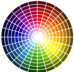
When making color choices, you also must consider contrast, which is the perceived difference in colors that are in close proximity to each other. This difference makes an object more distinguishable from the background.
Levels of contrast vary from high to low, depending on their position on the color wheel. For example, colors that are directly opposite one another on the color wheel have the highest contrast possible, while colors next to one another have a low contrast.
How do you choose an image for digital sign content?
Text should be limited on outdoor digital signage, so the image(s) you choose will be doing heavy lifting in your conveying your message.
When selecting an image for your digital sign, consider how your message will display with the image as a background by asking the following questions:
- How will text appear against the image?
- Will the image provide enough color contrast for your message to display clearly?
- Are you using an RGB image? Only RGB images will display corrected on an LED message board.
- Is the image the correct pixel size? The pixel size of your image should be as close to the same size as the pixel matrix of your LED sign. For example, if the sign matrix is 120×240, then your image size should be 120×240 pixels.
By following these guidelines, you’ll be creating effective, eye-catching outdoor digital signage content in no time!
You can also leave the content design to Optec! Contact Optec Displays today for a quote on content creation at 800-876-1668!