
Font selection is a core component of smart digital signage content. The right typeface allows you to present a clear, legible message that passersby can easily read and digest. Fonts that are too complicated, don’t contrast well with your background, or create a cluttered look for your sign won’t get your message across the way you need to.
When creating a content strategy for your LED sign, make sure you choose fonts that reflect your brand accurately and present your ideas clearly. Create clean, legible, and appealing content for your signage with these tips for choosing the right typeface for your digital sign.
Avoid Scripts and Italics
The simpler your text is, the easier it is to read. Scripted fonts that incorporate thin strokes and complicated flairs clutter your text and create a less legible message than simple, straightforward fonts.
This same concept applies to italicized words; the slanted letters of italicized text make it harder to read at first glance. If you need to italicize part of your message, limit it to one or two words maximum.
Not Too Heavy, Not Too Light
Thick and heavy fonts can look too blocky on your digital sign. The heavier your font is, the more detail you lose. This can cause the letters to blur together and become confusing or hard to read.
On the other hand, light and thin fonts don’t offer as much contrast from your background images or colors. Lighter fonts get lost in your content and don’t effectively draw attention from passersby.
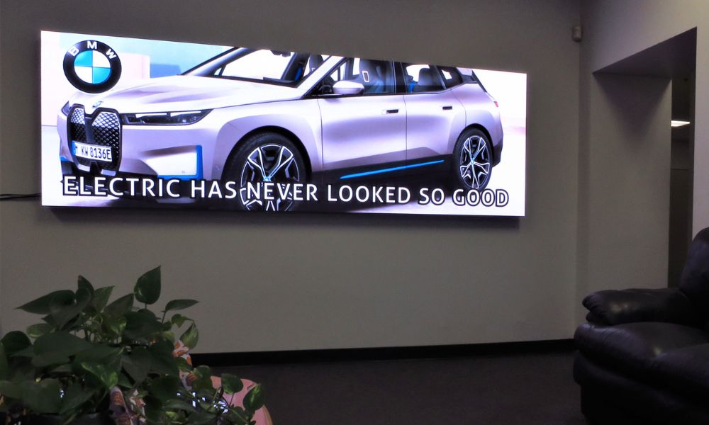
Stick to bold fonts that stand out clearly while still leaving space between characters for legibility.
Stick to One or Two Fonts
When choosing the right typeface for your digital sign, try to limit yourself to no more than two fonts. Too many font variations clutter your message and make your design look and feel busy. In addition to being harder to read, designs with too many fonts draw focus away from your words, creating less effective content for your business.
Capitalize When Possible
Capitalized letters are clearer, simpler, and easier to read. Lowercase letters often contain ascenders or descenders—parts of the letter that extend above or below the baseline of the text—which create more complicated characters. Capitalized letters feature a more streamlined design that creates a simpler image while taking up less space.
Be careful not to overdo your capitalization, though. Longer messages can feel overwhelming when you write them in capitalized letters. For example, if you have an indoor full-color LED display with more text on it than a typical digital sign, full capitalization can create an intensity that doesn’t match the intent of your content. For short and succinct messages, however, uppercase letters create a clear, bold contrast that makes your text stand out.
With smart content design and dependable digital signage on your side, you can create worthwhile content that draws attention to your business. Visit Optec Displays today to learn more about our digital display solutions and create the best content for your needs.